Destup Colors
The language of structured color. If you can read It, you can design it. Colors greys tints & shades that makes sense.
What is Destup Colors
Benefits and why use it
Who can use it?
Getting started


q Utramarine Blue colors tints shades greys

rIndigo blue colors tints shades greys

s Purple Ultraviolet colors tints shades greys

t Lilac Violet colors tints shades greys

u Magenta rose colors tints shades greys

v Magenta Pink colors tints shades greys

w Pink Rose colors tints shades greys

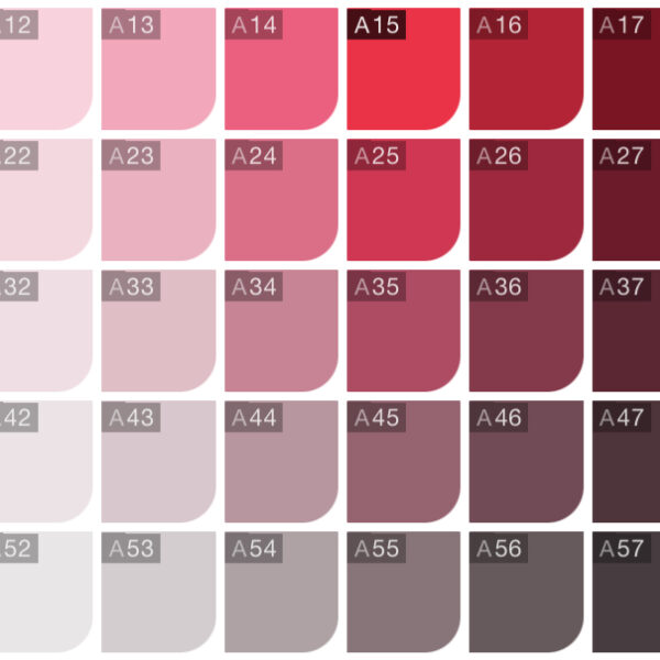
x Pink Red colors tints shades greys

r07 Deep Indigo Violet #2c037c


l07 Electric Signal Teal #009485

n67 Deep Teal Graphite #314a4f
p07 Deep cobalt indigo #03397c


u67 Deep eggplant plum #4d324d

j07 Jungle Voltage Green #008f43
o67 Deep slate blue-gray #31454e

t07 Deep orchid violet #69037d

Structured 24-Part Color System for Professional and Creative Screen Design
Destup is a complete color architecture with 1200 logically organized variations. Move seamlessly from vibrant saturated colors to refined colored greys and build consistent websites, apps, presentations and digital brands.
Designed for designers, creators, entrepreneurs and anyone who wants structured color harmony instead of random palettes.
A Practical Color System Built from Real Design Experience
Destup was created by graphic and web designer Arthur Wentzel to solve a common professional problem: inconsistent color scaling from vibrant hues to neutral tones.
Instead of relying on random palette suggestions, Destup offers a structured system that supports long-term brand development and consistent interface design.
What is Destup colors
Light web color palettes for screens focus on soft, airy, and high-legibility tones often pastel or muted shades to create a clean, modern, and trustworthy feel.
24 basic colors
The color circle devided in 24 visually well devided portions of colors. Each piece of the cake has a letter from A to X.

50 tints per color
The color circle devided in 24 visually well devided portions of colors. Each piece of the cake has a letter from A to X.
Benfits and why you love it
Light web color palettes for screens focus on soft, airy, and high-legibility tones often pastel or muted shades to create a clean, modern, and trustworthy feel.
Structured system vs generators
Most existing tools generate palettes or display simple harmony wheels. Destup provides a systematic matrix of 1200 colors with a consistent logic between saturation and lightness values. Something almost no mainstream tool offers.
Hermetic harmony logic built-In
Standard color wheels show harmony relationships, but they don’t usually embed hermetic complementary, triadic and tetradic sets with strict numeric positions like Destup’s 24-letter system.
Designed for repeatable workflows
Destup aims to serve both professionals and amateurs with consistent color transitions that scale from screen UI to branding. Most color wheels simply suggest palettes without structural depth.

Complentary color system
Light web color palettes for screens focus on soft, airy, and high-legibility tones often pastel or muted shades to create a clean, modern, and trustworthy feel.
116 Light colors
Light web color palettes for screens focus on soft, airy, and high-legibility tones often pastel or muted shades to create a clean, modern, and trustworthy feel.
116 Dark colors
Light web color palettes for screens focus on soft, airy, and high-legibility tones often pastel or muted shades to create a clean, modern, and trustworthy feel.

30 Bright colors
Light web color palettes for screens focus on soft, airy, and high-legibility tones often pastel or muted shades to create a clean, modern, and trustworthy feel.
116 Medium colors
Light web color palettes for screens focus on soft, airy, and high-legibility tones often pastel or muted shades to create a clean, modern, and trustworthy feel.

58 Light colors
Light web color palettes for screens focus on soft, airy, and high-legibility tones often pastel or muted shades to create a clean, modern, and trustworthy feel.
116 medium colors
Light web color palettes for screens focus on soft, airy, and high-legibility tones often pastel or muted shades to create a clean, modern, and trustworthy feel.
58 Dark colors
Light web color palettes for screens focus on soft, airy, and high-legibility tones often pastel or muted shades to create a clean, modern, and trustworthy feel.
58 Light colors
Light web color palettes for screens focus on soft, airy, and high-legibility tones often pastel or muted shades to create a clean, modern, and trustworthy feel.


116 Medium colors
Light web color palettes for screens focus on soft, airy, and high-legibility tones often pastel or muted shades to create a clean, modern, and trustworthy feel.
116 Medium colors
Light web color palettes for screens focus on soft, airy, and high-legibility tones often pastel or muted shades to create a clean, modern, and trustworthy feel.


